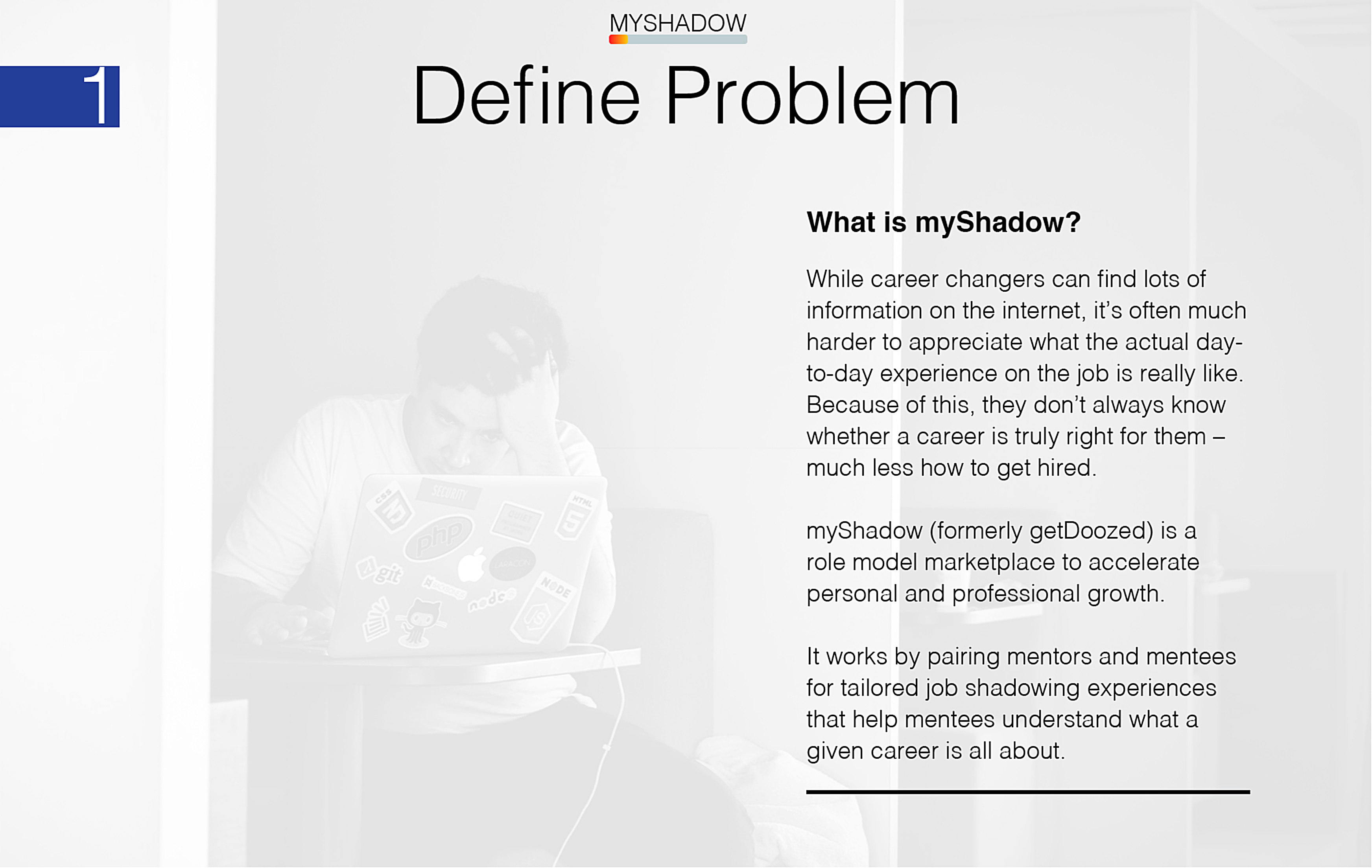
Today people are switching careers more frequently than ever. While career changers find an abundance of information on the internet, it’s often much harder for them to appreciate what the actual day-to-day experience on the job is really like. As a consequence, they don’t always know whether this career is truly right for them – much less how to get hired.
Social media often exacerbates the problem. Professional networking sites like LinkedIn offer shallow connections and superficial information about people’s jobs that lacks a rich context for understanding. These features make it hard for job seekers to make a meaningful connection with mentors who could give them advice.
How might we create a marketplace that matches mentors and mentees for job shadowing experiences? And how might we grow this marketplace into a community of lifelong learners – mentors and mentees – who are striving to become the best professional version of themselves?
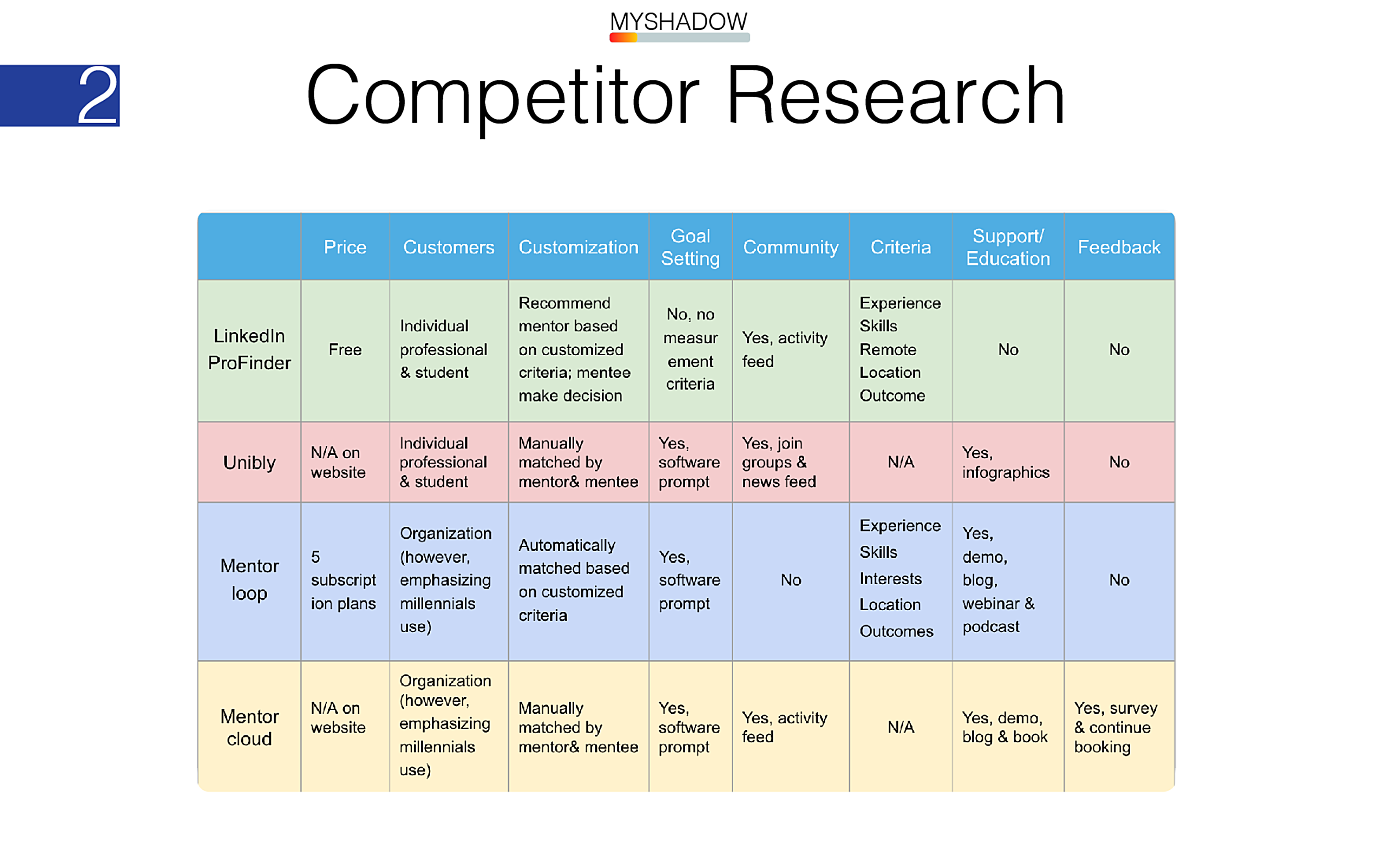
Based on our competitive analysis of other companies in the mentoring space, we found a ripe opportunity for a company that facilitates in-person rather than remote mentoring experiences; that’s tailored to individual interests and goals; that provides user support (including feedback, assessment, and goal tracking); and that fosters a community of learners.
Our market validation also illuminated robust potential demand for this service: LinkedIn alone boasts 67 million users who are professionals in non-decision making positions. myShadow could attract these users through different pricing plans, such as pay-as-you-go or by monthly subscription.
What’s the story that myShadow lets our users to tell about themselves?
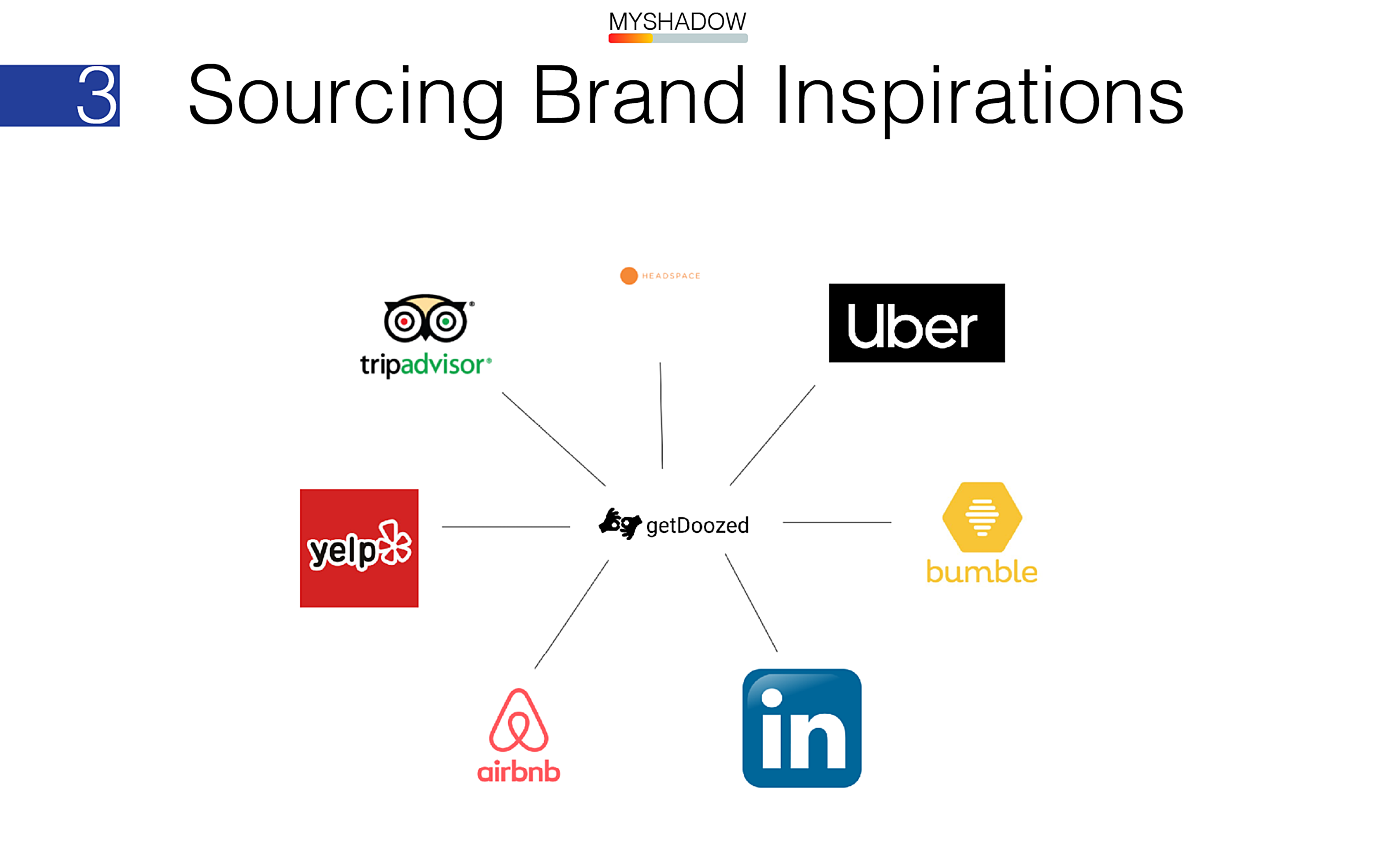
As a career matchmaking service, we drew inspiration from brands in analogous marketplaces, for example:
- Hosting (apps like AirBnB that match guests with hosts);
- Ride-sharing (apps that use algorithms to filter and match riders with drivers);
- Dating (apps that find fun, creative ways to let people connect by facilitating a personal connection);
- Travel (apps that include an upvoted system of user reviews to help users prioritize information);
- Dining (apps that help users search and filter for dining experiences in their area);
- And self-improvement (how to deliver an experience of openness and optimism about themselves and their future).
We translated these features into a set of style principles to guide our UI design. The myShadow experience should be clean, trusting, personalized, helpful, reassuring, inspiring, and a little bit playful.
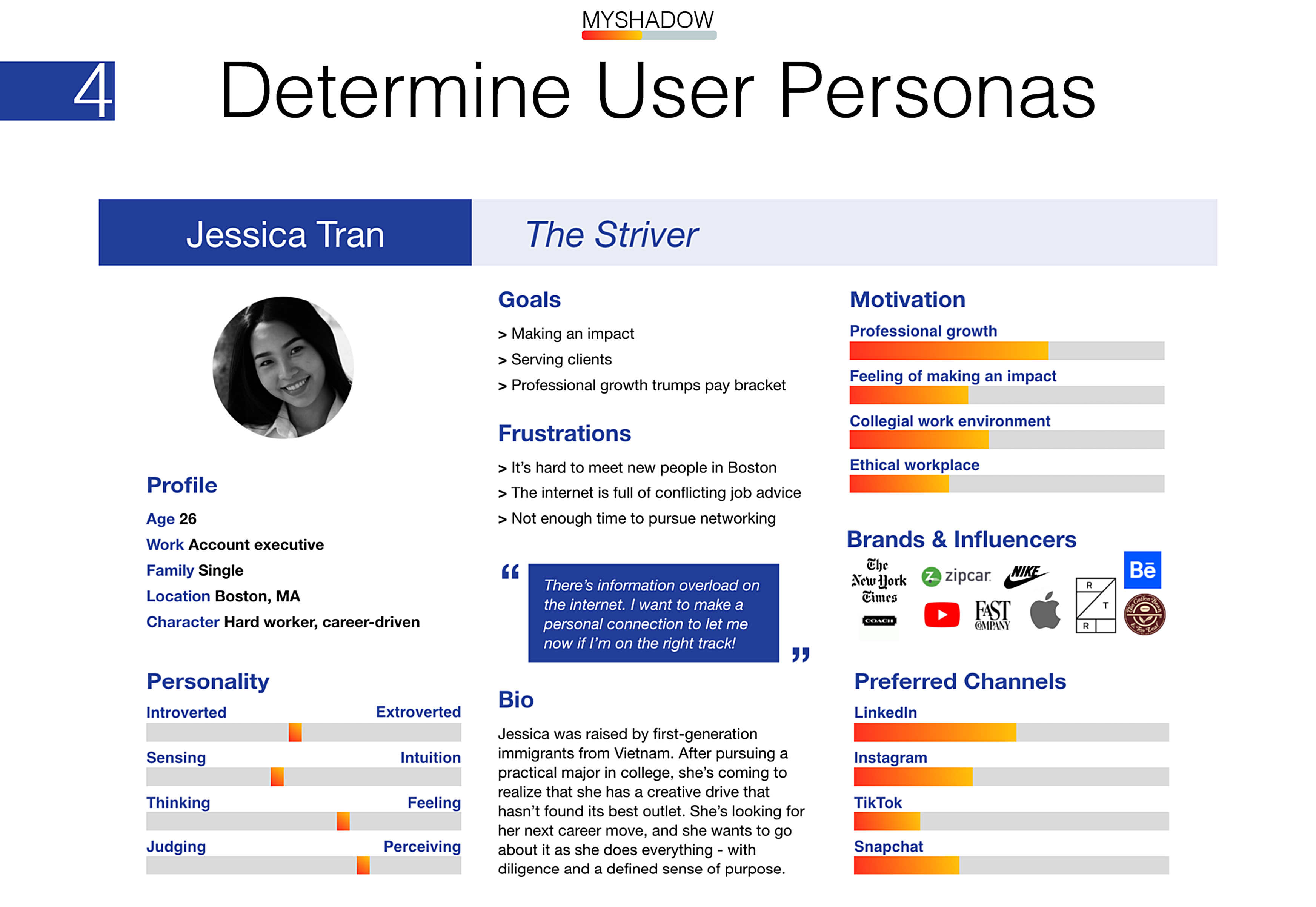
We need myShadow to be helpful, informative, and customized to users' interests and priorities. This will help proactive users like Jessica find easy value in our service.
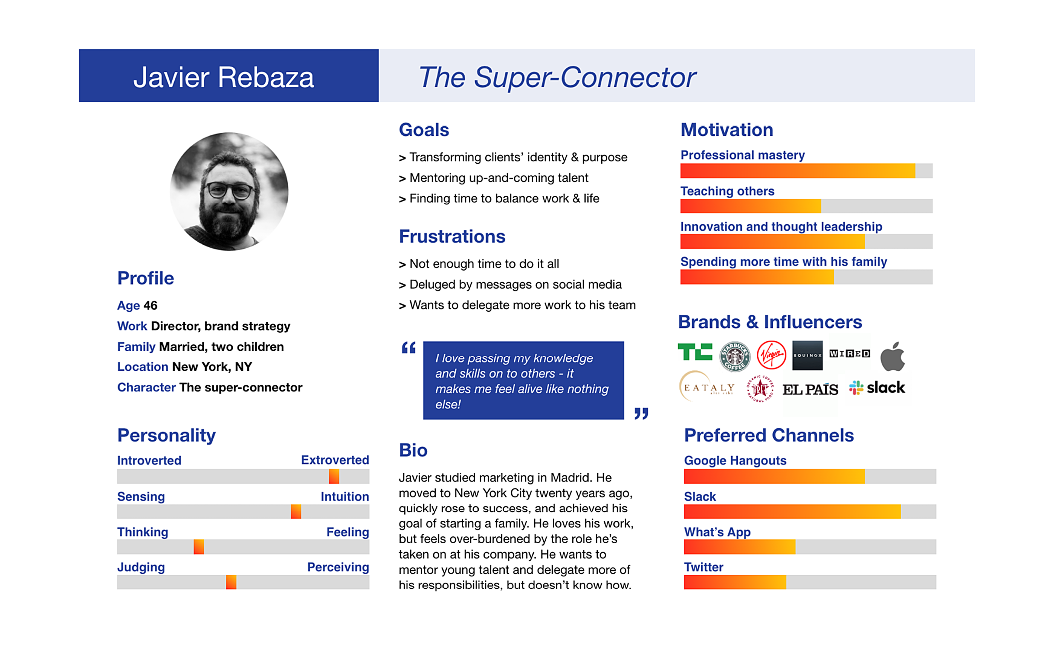
We need myShadow to provide some motivational metrics to incentivize mentor participation. We also need filters so they're not bombarded by messages from under-qualified mentees, to save users like Javier a potential headache.
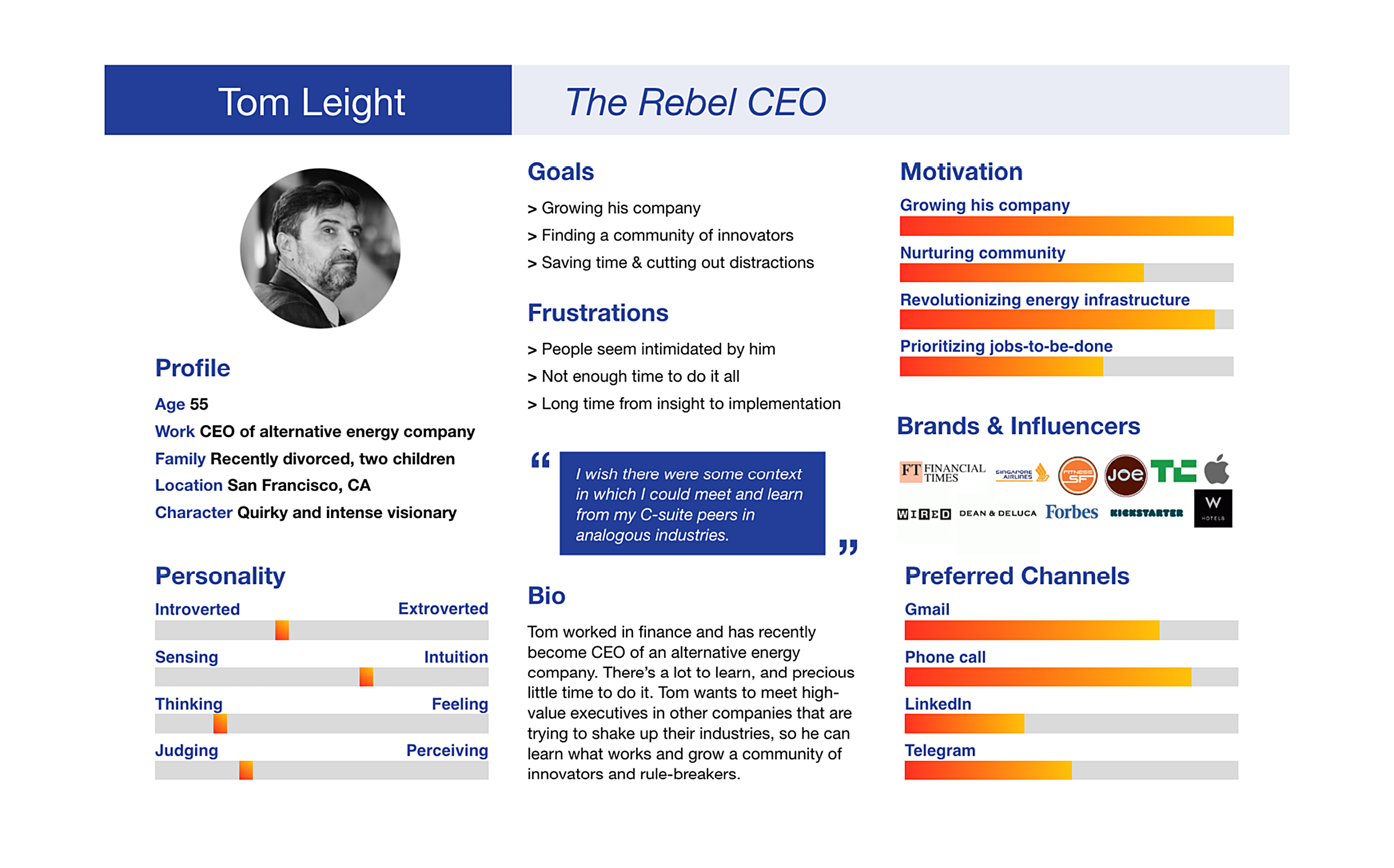
We need myShadow to be discrete with users' data. To fit Tom's needs, we also need myShadow to foster a community of users who can get to know each other and share resources on a need-to-know basis.
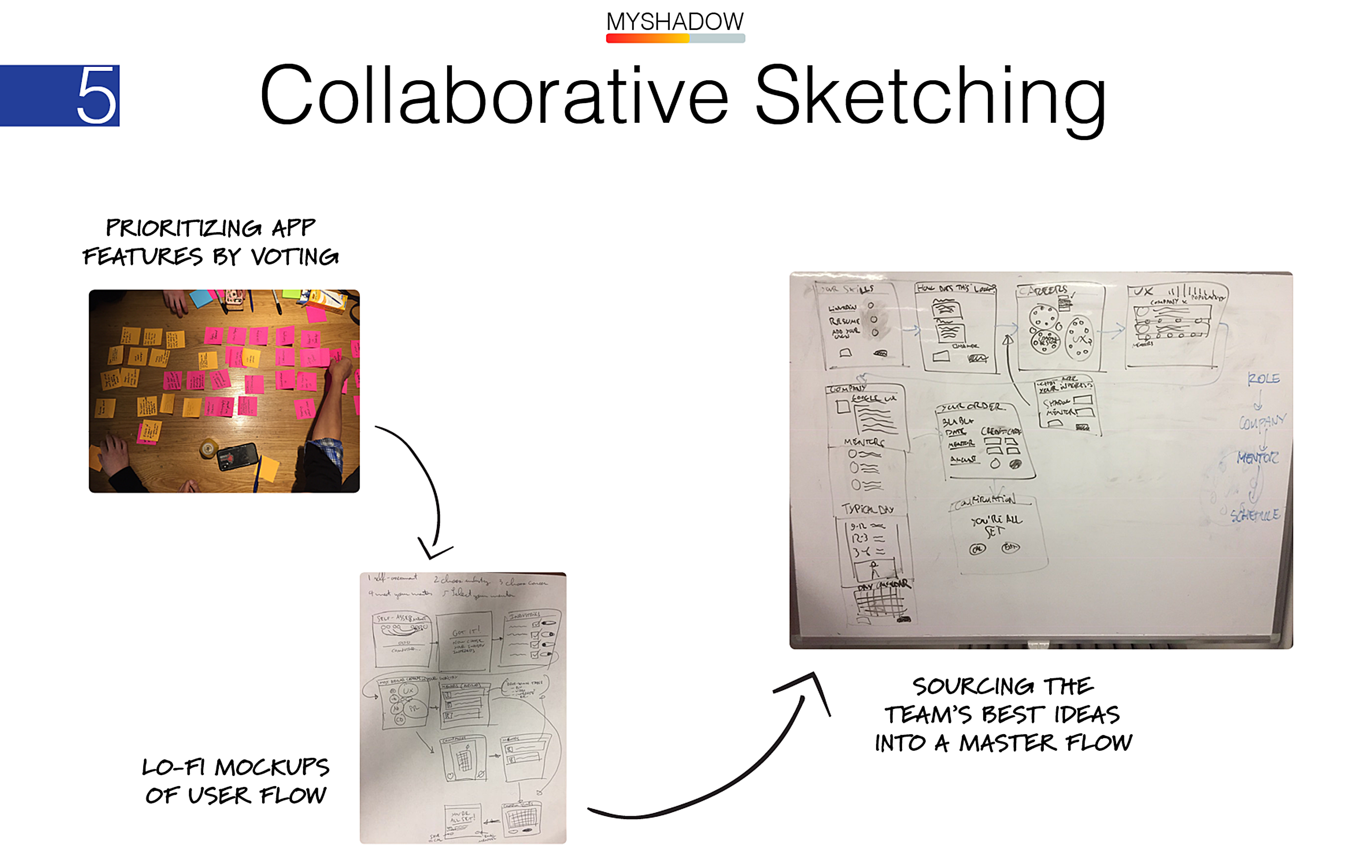
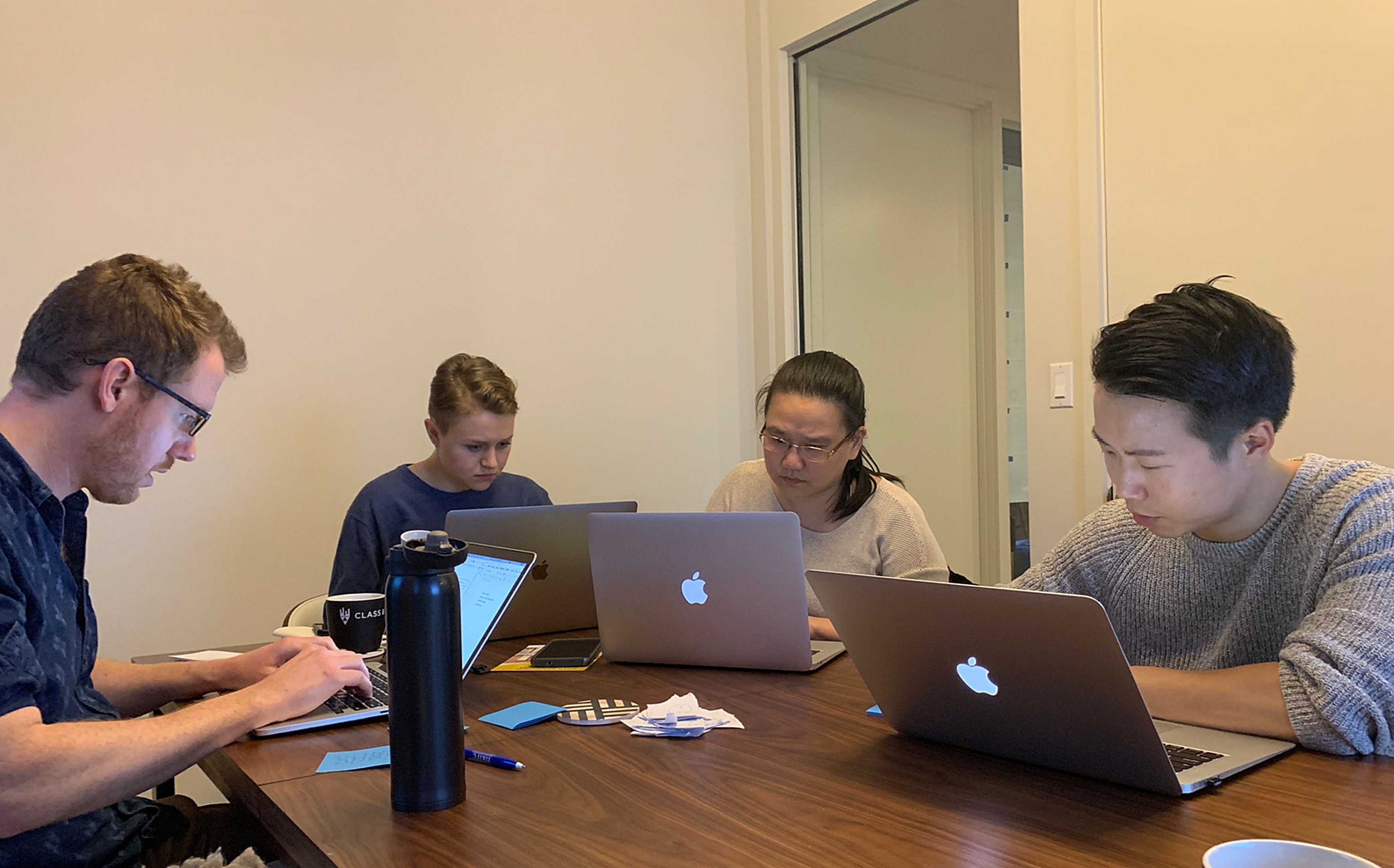
In our first meeting with the startup founders, Katya and Aryuna, my UX design partner Kexin and I organized a 1.5 hour design studio to prioritize user flows and source ideas from the team. We realized it was important to get buy-in for any designs from the start, and this process helped the team members align their goals.
We ended the session with a clear vision of the primary user flow we would build over the upcoming few weeks. The final sketch on the eraseboard incorporated UI ideas from every member of the team, and served as a jumping off point for our wireframes.
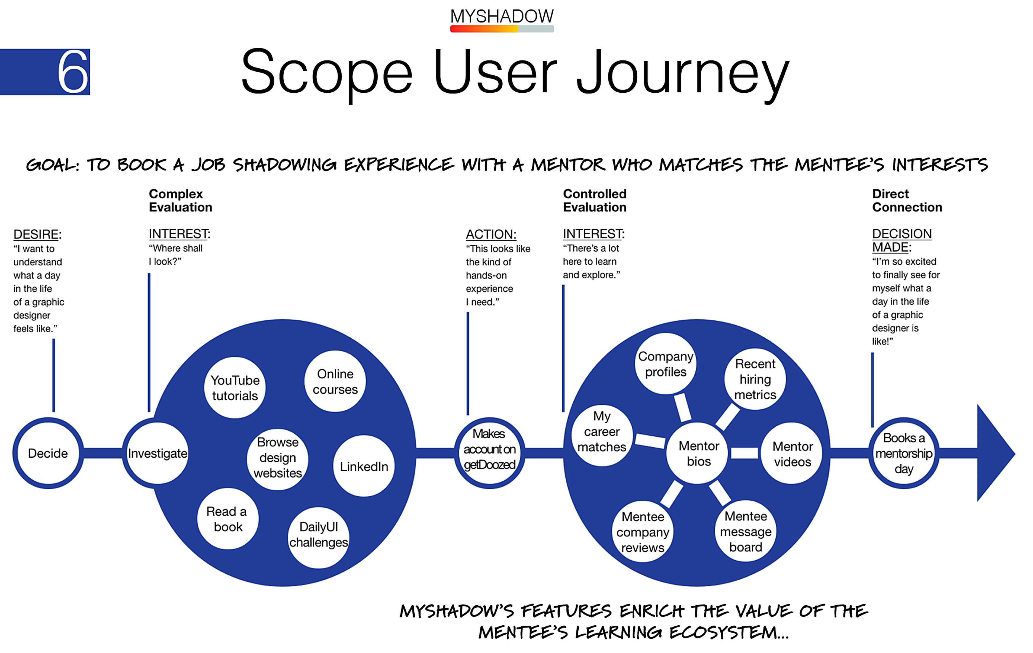
My first order of business was to create a user journey that gives our user flow some context and illuminates any dependencies that could become user experience features (or liabilities) of our site. I did this by brainstorming the different points along the decision funnel that drives a user from awareness to action - in this case, signing up for a mentorship with myShadow.
The user flow I created takes stock of the feelings, thoughts, beliefs, and actions that a fictional user persona would experience along the path from wanting to explore a new career to booking a mentorship experience on our site.
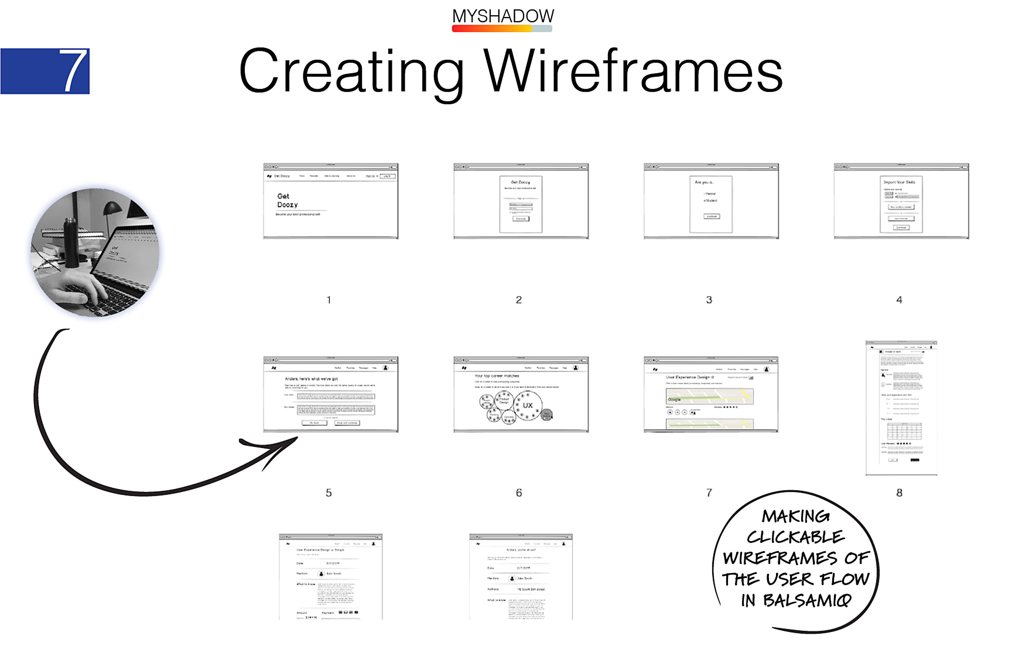
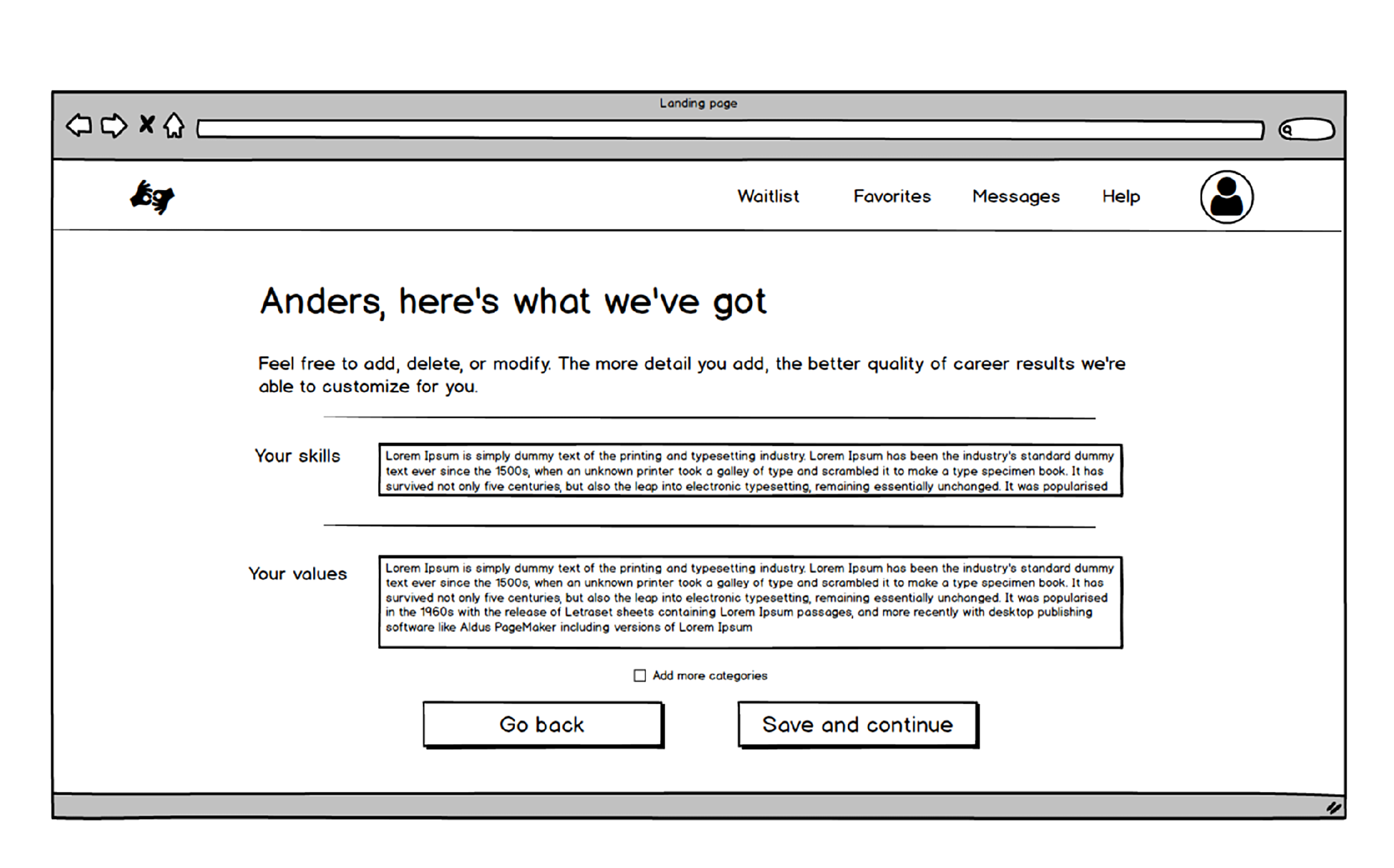
Next, I built low fidelity wireframes in Balsamiq that transform each step in the user journey into a webpage that delivers the experience the team had collectively outlined during the design studio.
We took these wireframes back to the founders to get approval of the scope and functionality of the flow before we invested in creating to-scale mockups.
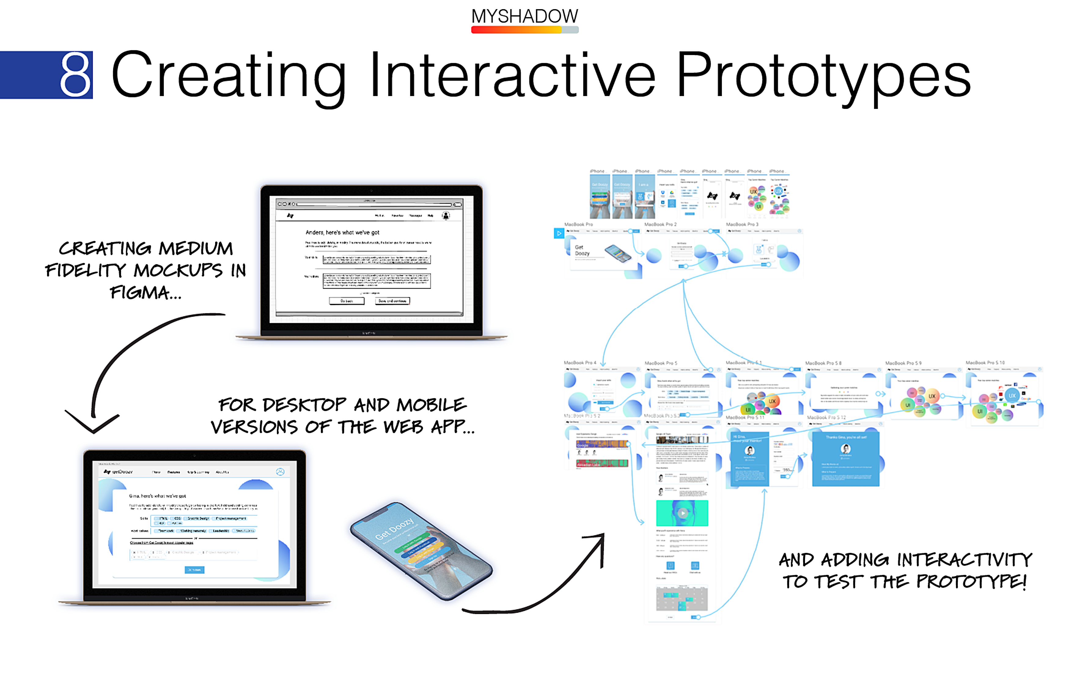
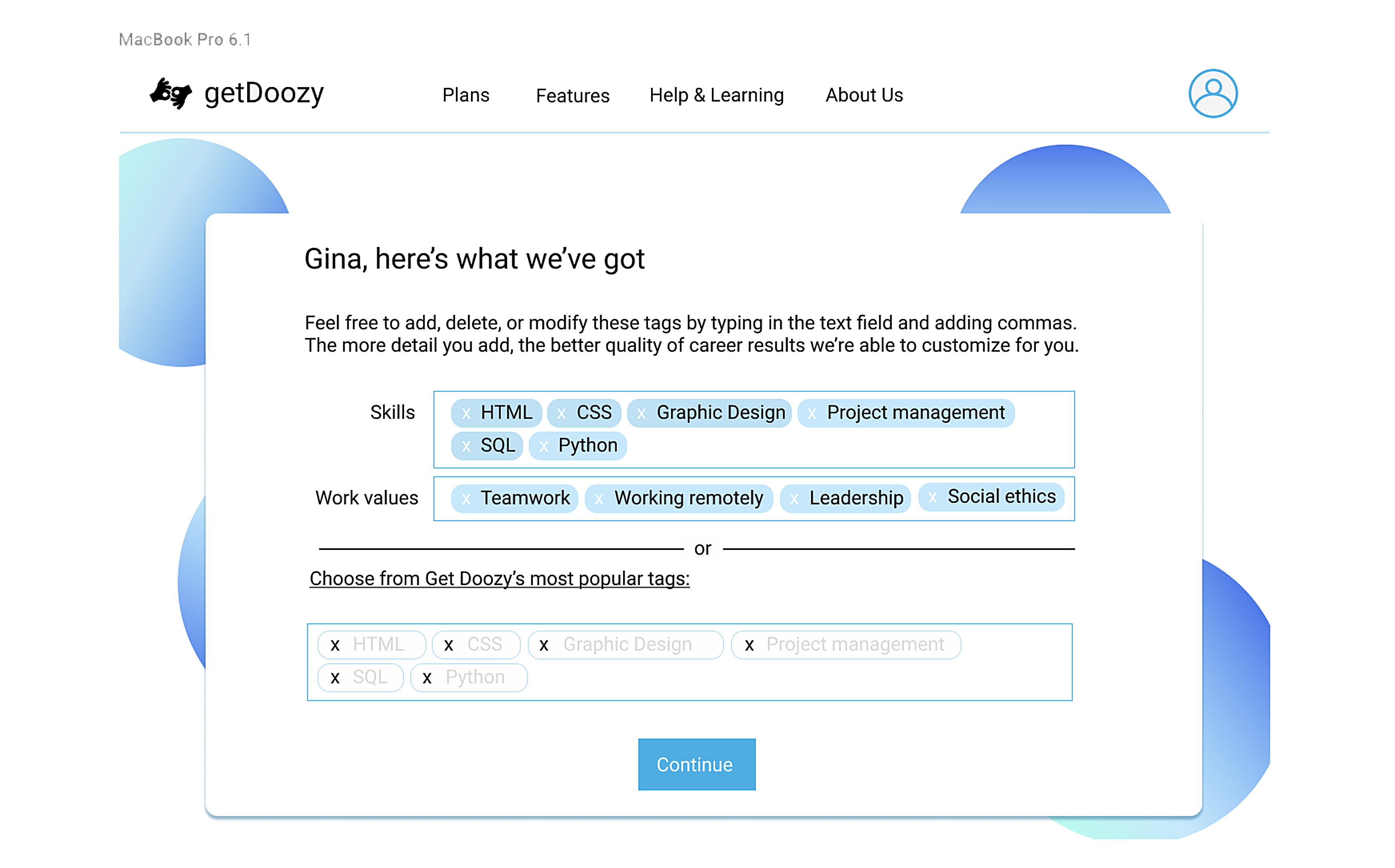
My teammate Kexin and I then transformed these wireframes into medium fidelity mockups using Figma, a collaborative design tool.
This meant choosing specific interaction affordances that would achieve the functionality and experiential richness of the founders' original vision. To do this, we built mobile and desktop versions of the app that we prototyped as clickable models that our stakeholders can test in their web browser.
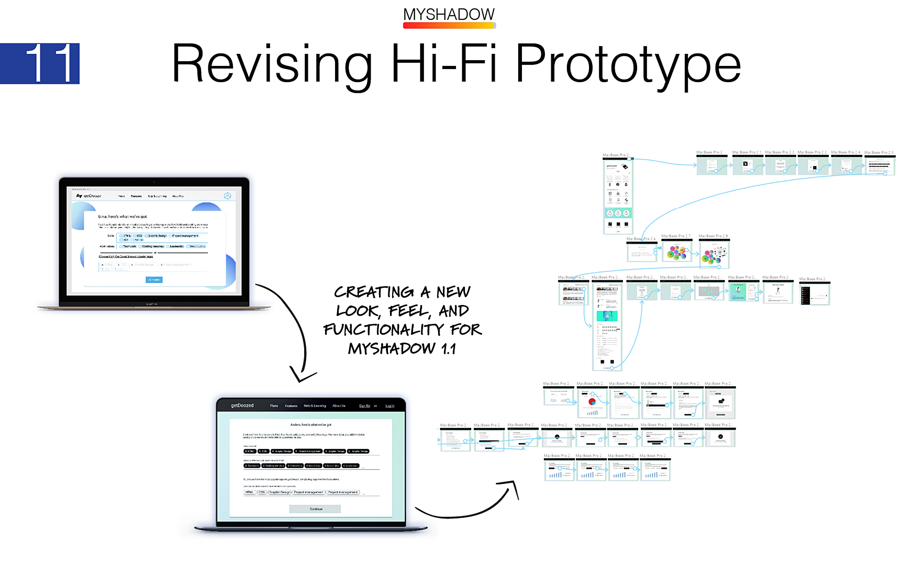
After presenting our prototype in a follow-up meeting with Katya and Aryuna, we discussed some features they wanted us to add to the prototype. We also discussed making changes to the style and branding of myShadow.
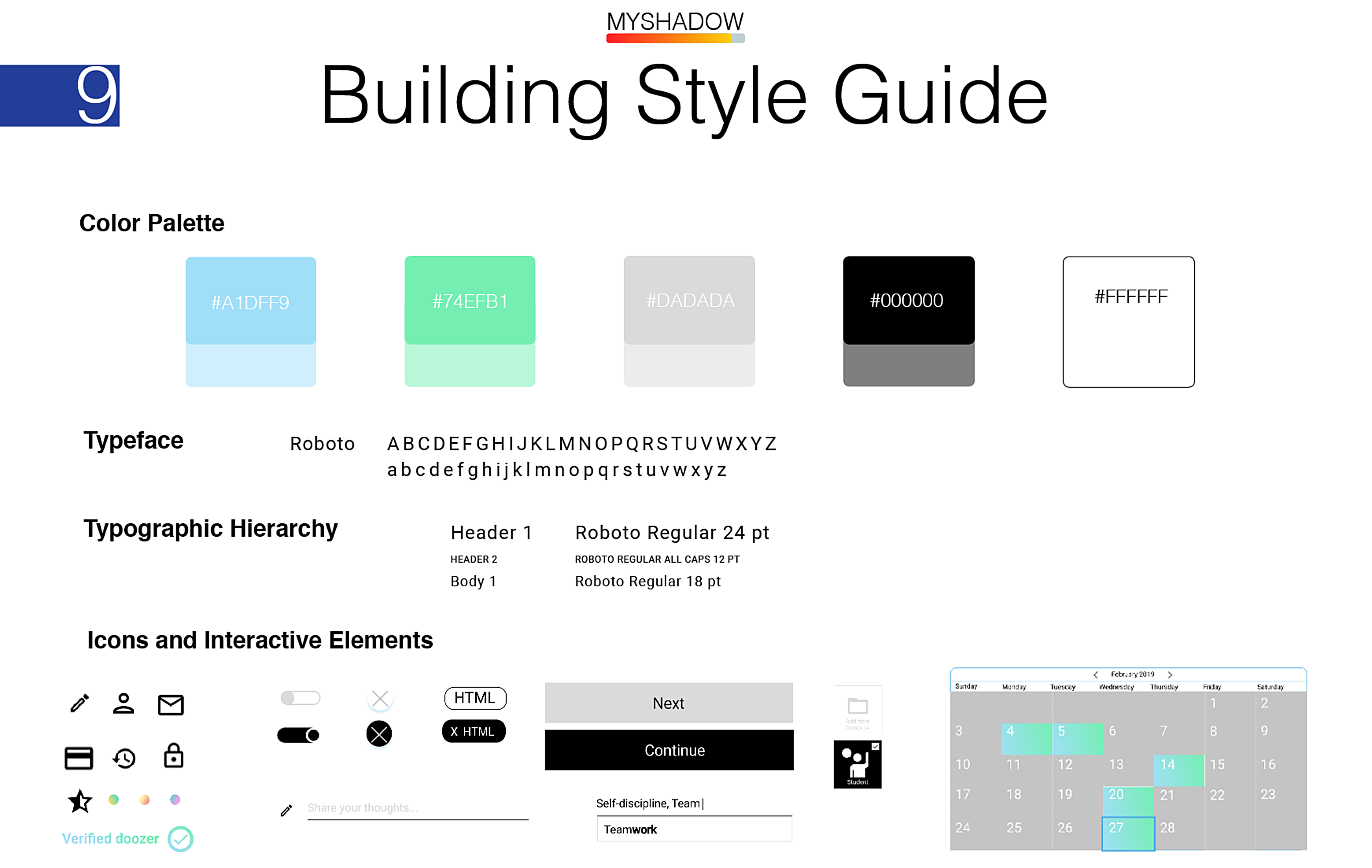
We realized the presentation of the app could be simplified even more by reinforcing clarity, consistency, and information hierarchy inside the prototype. Our process of creating a new skin for myShadow was inspired by the design language of Uber. We simplified our color palette; oriented our design around grounding black and white color elements; developed a simplified typographic hierarchy; and developed an accessible library of icons and interactive elements inspired by Google’s material design language.
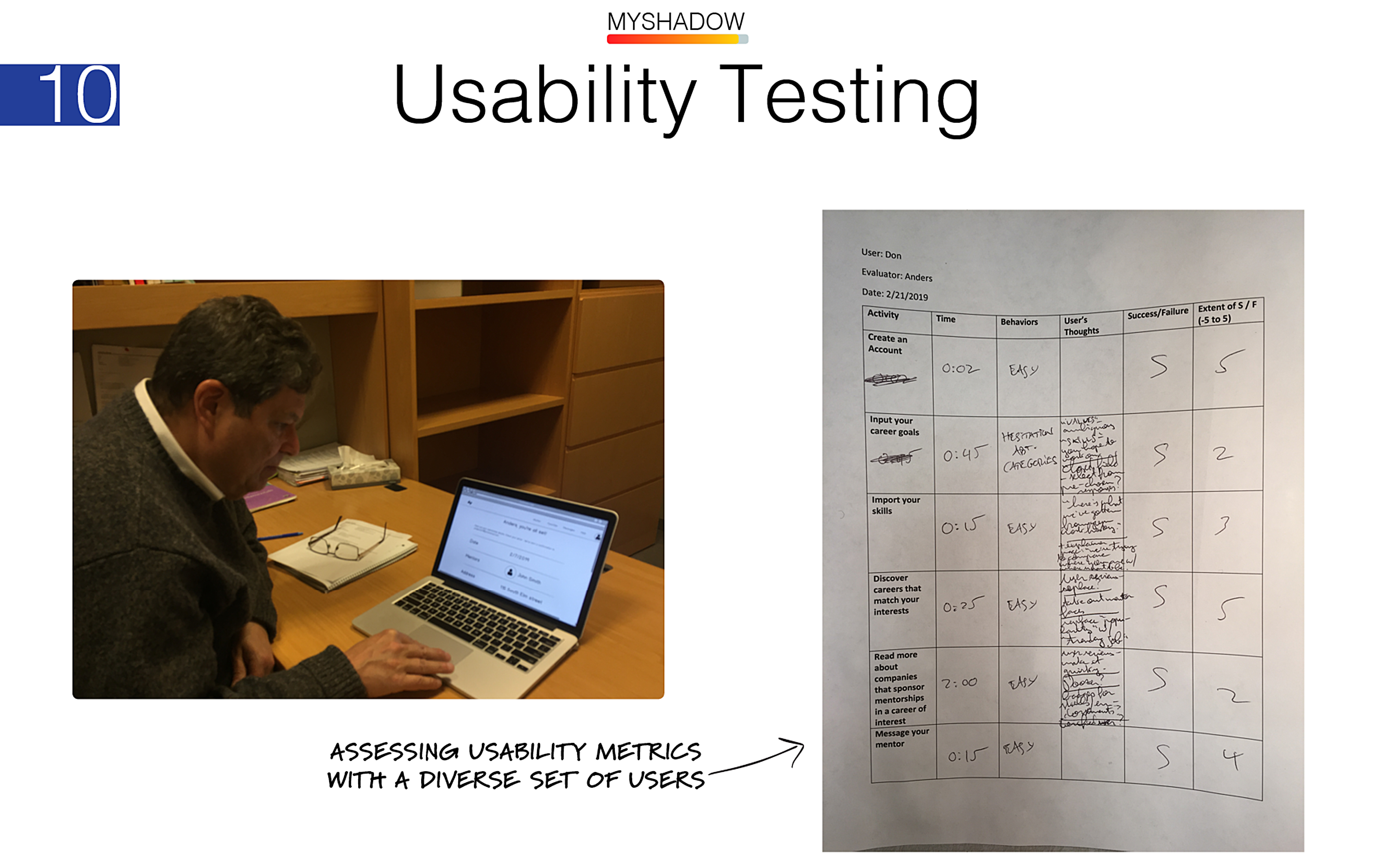
Before iterating version 1.2 of the prototype, Kexin and I conducted usability testing with five test subjects, including: 2 design students at Pratt; 2 PhD students at CUNY; and 1 career counselor with decades of experience in the career counseling field.
Feedback from our user testing sessions helped uncover:
- Users' concerns over privacy and safety of their data;
- Concerns over the trustworthiness of mentors (“Are they who they say they are?”);
- Ambiguity in a few places where copywriting wasn’t clear;
- Desires for additional relevant information about careers that myShadow could provide;
- And some doubt about the system of user reviews of mentors, centering mainly around possible issues of bias, discrimination, or ensuing resentment that could surface from this feature.
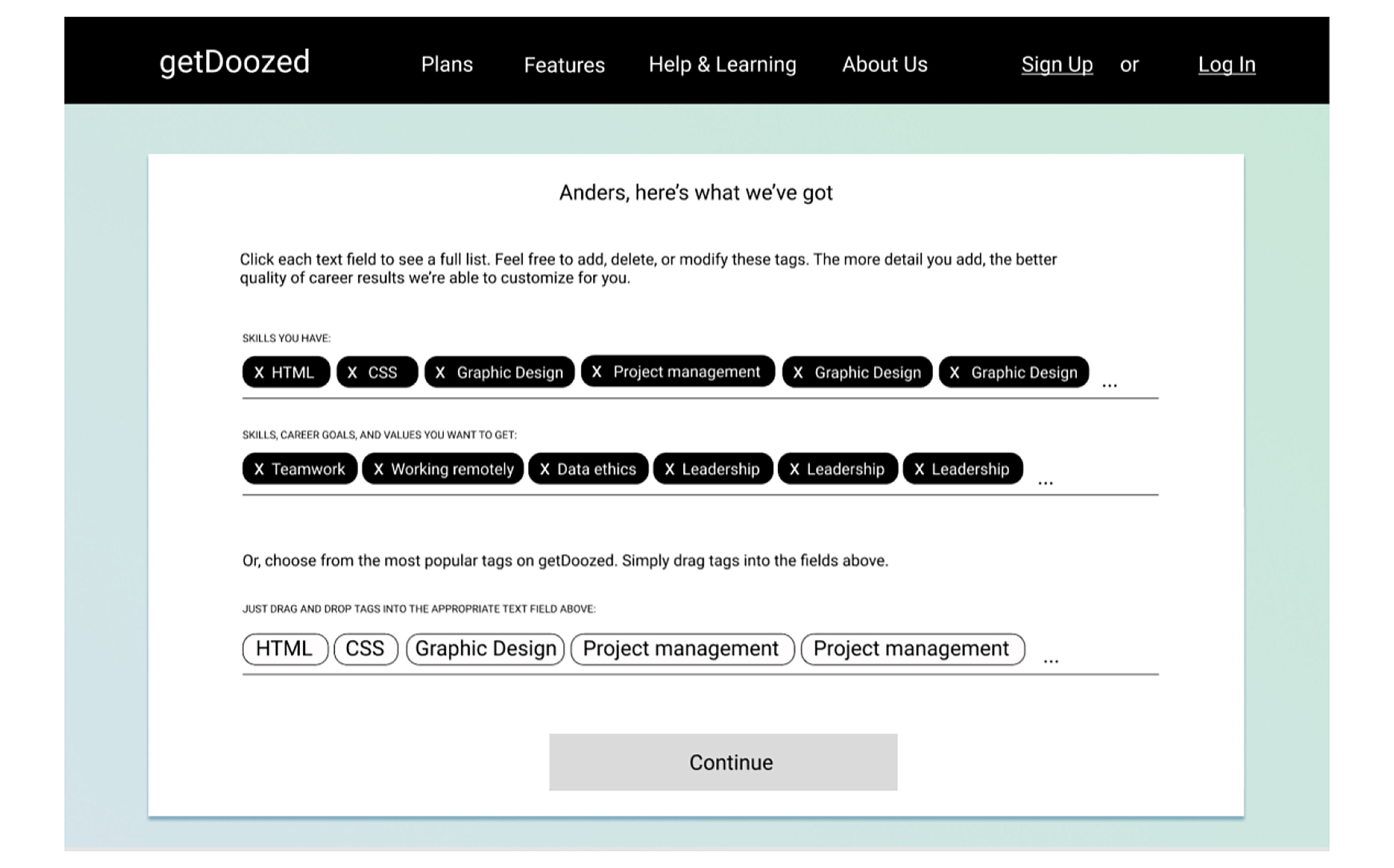
We shared our findings with the rest of the team. Together, we decided to deliver revised versions of the prototype that would include a greater focus on transparency.
In this case, transparency meant implementing the following things:
- Creating filters to better match mentors and mentees via customizable questionnaires;
- Letting the mentor choose from a menu of options to decide how they are compensated for their time;
- Creating a goal-setting feature that helps mentees track their progress, and helps mentors track their impact;
- Creating a personal dashboard that shows mentors and mentees about their relevant achievements.
With our style changes and usability testing feedback in hand, Kexin and I set out to prototype the second iteration of the app.
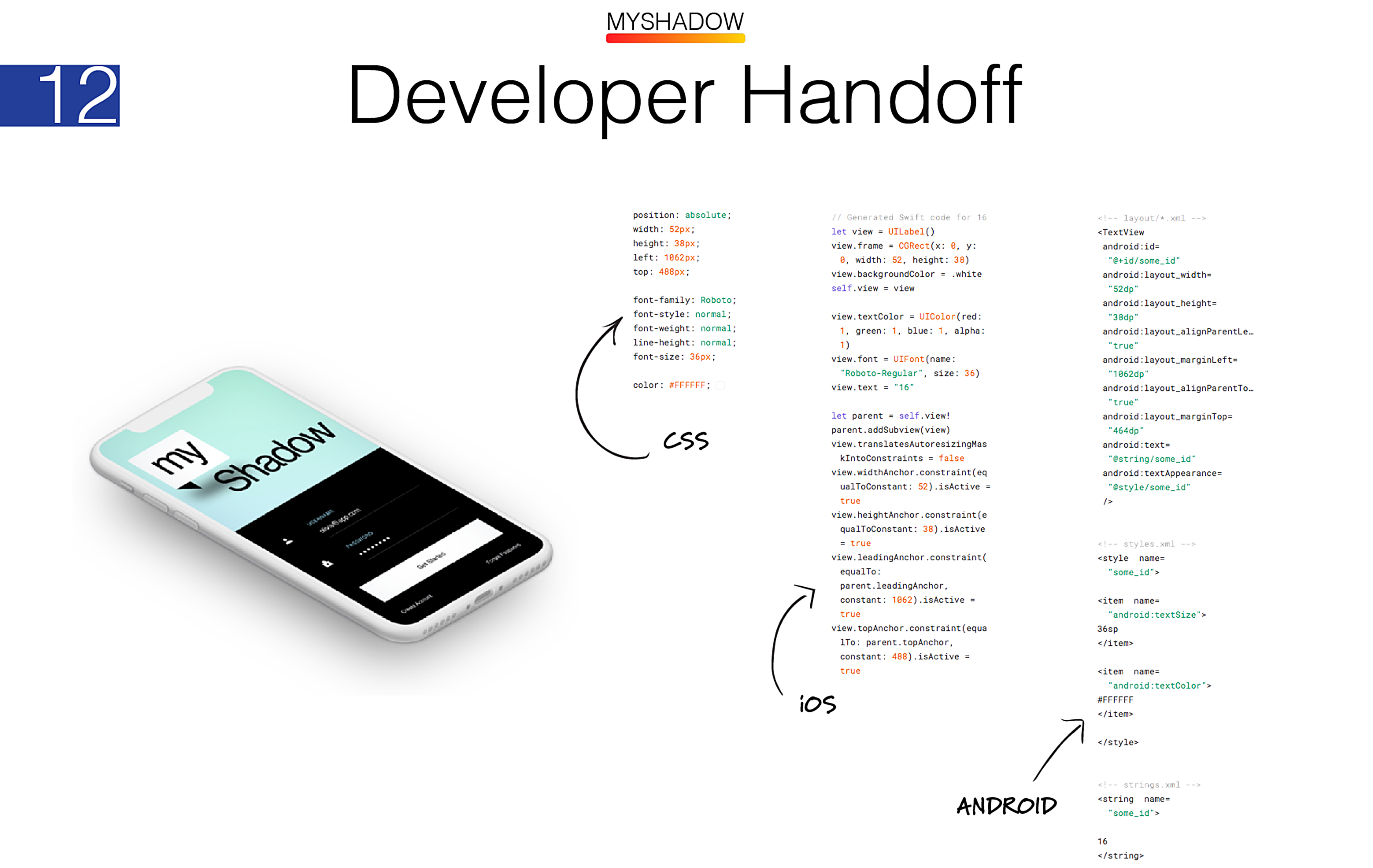
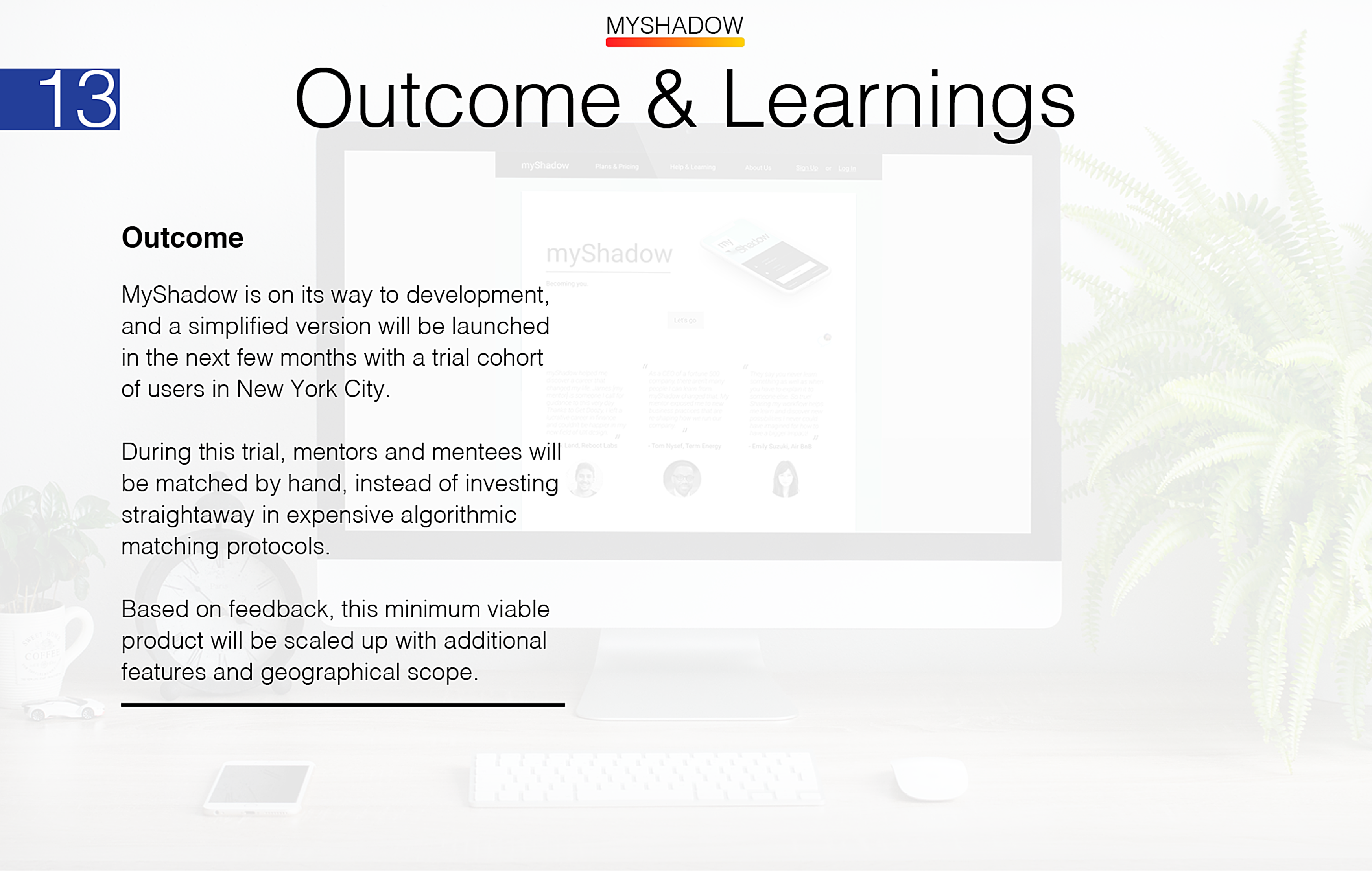
The next step was to liaise with the development team in Kiev, Ukraine, to create a live beta version of myShadow. For our product launch, our plan is to create a live website and match mentors and mentees by hand. This would help the team identify and eliminate any remaining issues before investing in back-end development.
A benefit of working in Figma is that Figma exports code for HTML/CSS, iOS (swift), and Android for all of the prototype elements we had created. This made the developer’s job easier.